Posts

Showing posts from January, 2019

Extended project

Image
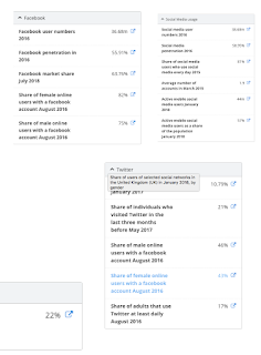
I decided to change what my extended project is going to be. At first I wanted to make an example of something that would be shown at the exhibition, and some social media accounts that would be for the exhibition, however I decided that these would be quite boring and would not look very good, as well as I wanted to try something that I had not done before. So I decided to make some infographics that would go along with the exhibition, I am going to make three, one for each of the sections of the exhibition. These posters will show statistics on each of the topics and will include imagery that goes along with the statistics. For the social media poster, I want it to be in four sections, each representing a different social media. So there will be one for Facebook, Twitter, Instagram and Snapchat. Each of these four areas will have a background color of the main color of the page, then the logo and some statistics shown underneath. The radio and television poster will have hal

Leaflet- envelope

Image
I looked at lots of different envelope folds, such as the triangle fold, heart fold, circular fold, etc. I decided to go with a regular square fold, because I wanted to keep it simple and I liked the way that it looked at the end, as it had triangular edges rather than curved. I wanted the color of the envelope to match the color of the leaflet, so I had it be the navy blue color of the background, then I added a turquoise line to make it match with the style of the leaflet, as well as the posters as they all have lines included. I then included the L from link, as an emblem on the front. I was not sure what to put on the front to ensure that someone opened it, as they might have thought that it was meant for someone else.

Leaflet

Image
At first I wanted the leaflet to emulate the style of a magazine and have multiple pages inside of it. However I realized that it was going to be a lot of work and would not look as good as I thought it would. So I decided that I was going to have it in an envelope, so it emulates an invitation and will intrigue people to open it rather than just throw it away. I wanted the leaflet still to look like a magazine cover, so I placed the text in areas similarly used on covers of magazines, I also added a barcode, however I wanted it to be more of a pulled back and abstract version of one. Once I had finished most of my leaflet I realized that it was too empty, and needed something extra being added. So I tried to add some of the elements from the posters, but they did not fit well. In the end I decided to add the sound waves from the second poster onto the leaflet, I also changed the color to be a darker tone of the teal color used, this is so that it does not pull t

Style sheet

Image

Typography

Image
The font that I have chosen to use for my poster is called ‘Sunday Afternoon’ off of the website DaFont. I chose this font because it is easy to read but does not look boring and has little quirks that I like a lot. Also it matches with the style of my logo as it is quite cartoonish.

Color scheme

Image
My color scheme is orange, black and white. I chose these colors because they are simple and I only chose three colors because I did not want to over complicate it. This is going to be the color scheme for the whole exhibition, not just the posters, I want this as it will make them all match and look as if they are meant to go together. I looked into the psychology used behind certain colors within marketing, and found that red means excitement, bold and it physically stimulates the body by raising the blood pressure and heart-rate, these are all qualities that I would want my viewers to feel when looking at the posters, as it will make the viewers excited to see the exhibition and want to increate their interest in it. I also chose a warm toned red as this will make people feel warm, which is something that the visitors will want to feel when they are at the exhibition.

Final name

Image
The final name for my exhibition is Link. The definition for Link is ‘a relationship between two things or situations, especially where one affects the other’, this is the main reason as to why I decided to choose this as the name, because it means something that is connected and has an effect on the other things. This is what news is, it is all linked together, there would be no radio news without broadsheets etc. It could also be referring to people being connected by the news, for instance the news of Brexit was spoken about in many different countries, I found many articles on news channels in Germany, Italy, France and America, so news has linked the UK with lots of different countries

Logo

Image
I came up with three different logo concepts, then made some logo designs based off of this concept. I wanted all the designs to be based on retro things that link with the poster ideas, so I made some retro radio designs, and a retro television, and some newspaper designs. These are my final three ideas for my logo, I am going to adapt some of them, but these were my favourites out of the ones that I came up with.

Mock ups

Image
Poster 1 The idea behind this poster is that it shows news coming from a newspaper. The style I chose is a broadsheet, this goes along with the idea of news, also it is a quite iconic and easily recognizable style of newspaper Poster 2 This poster is meant to represent news being delivered through radio and tv. I wanted to do a sound wave style, as it shows the next evolution of delivering news, but is not boring and just has a picture of a radio or tv. Something that I like about this poster is that it is quite abstract  but people would be able to recognise what it is showing. Poster 3 For this poster I wanted to show social media and phones in a way that was more abstract and did not just have a phone or social media page shown. I decided to make a web like shape, this is supposed to represent the world wide web.

Broadsheet poster

Image
The first poster is going to be a broadsheet, and they contain lots of text so I have to plan out what is going to be written on it. I think that I am going to have information repeated multiple times. This would be: -Opening times (However not important on all posters) -Name -Tagline -Dates that it is open -Location These should be included on all of the posters, as it is quite important for the viewer to see, to be able to go to the event.

Extra materials ideas

Image
For the extra materials some ideas that I thought of was: -Social media for the exhibit -A website -Layout plans for the exhibit -A piece from what would be in the exhibit (I.e. a recreation of an old broadsheet) My favorite ideas are making a piece from the exhibit and the social medias. I like the social medias idea because it links to what the whole exhibition is about. I like the idea of making a piece for the exhibit because it gives a better idea of what my overall idea is for the exhibition. I think that I am going to do both because they are both quite easy to do, however I am going to leave it until after I have finished my posters and leaflets, as I would prefer to make sure that they are the best that they could be before moving on.

Leaflet ideas

Image
For the leaflet I want it to emulate a magazine, as this will link it to the news parts of the exhibition. I do however want it to be more exciting than a normal leaflet, so it would fold differently than a normal one, I want this because it will catch the viewers attention and make them intrigued. 

Exhibit ideas

Image
The exhibit would be split into 3 sections, each representing what each of the posters how, different stages of the evolution of news. So the first one would be broadsheets. This area would have recreations of old broadsheets, and show newer versions of them. There would also be information about broadsheets. The second section would be the next stage, which is tv and radios. This area would contain original old radios and televisions, these would be showing the information. The third and final section would be about social media. This are would contain big screens where people can view information on social media sites. There will also be snapchat codes/QR codes around the area, that people can use their phones to scan and can see extra information through these. I want the exhibit to be quite interactive and to contain lots of UX products.

Name ideas

Image
To come up with a name for my exhibition I put in a word that links to the topic of it into a thesaurus and chose some words that I liked out of the ones given. For instance I put in the word ‘News’ and then chose some words like: Broadcast, Message, Data, Report, Newscast and Announcement. However I want the name to be quite short and snappy, as this will be easier to put onto my posters, and because it'll be easier for the audience to remember the name. My favorite name so far is ‘Link’, this is because it stands for how the news links people together.

Initial idea

Image
My initial idea is to have the posters based around the ways that news is delivered to people through the times. For instance the first poster would be for a newspaper, the layout would be in the style of a broadsheet. The second poster would be for radio, and would feature sound waves. The third would be for tv, this would have imagery shown somehow. I have however not fully bulked the idea out yet. When I spoke to mark about this idea, he suggested that I have radio and tv put into one poster, and have the third one be for Phones and social media.

Moodboards

Image

Mind map

Image

Radio and television statistics

Image
I found a report that was conducted by a website called OfCom, where they found out statistics about news on the radio and televisions. They found out stuff liked which is the most-used platform for people to find out news and which station is the most popular, i.e. Television and BBC One

Print newspaper statistics

Image
I looked on a website called ‘News Works’ and they had all the statistics that I found on print newspapers, they also had a PDF that contained even more information and infographics (Linked below) I found out that print news papers are consumed more by men than women, aged 55+. It also reaches 1 in 4 adults, which is 12.7 million people everyday, and 1 in 3 young people every week. Everyday the ‘Daily Mail’ reaches 1,252,144 people, and is the second most read UK newspaper. The first however is the ‘Sun’ which is not a broadsheet. https://drive.google.com/file/d/1DIevdr6frzGrc0VX0v5M0O76IBqnyiN0/view https://www.newsworks.org.uk/market-overview

Statistics of social media

Image
I looked on a website called ‘Statista’ and found some general statistics about social media. I found that Facebook user numbers is 63.76% of the population from July 2018. 21% of people visited twitter in 3 months before may 2017, however this is likely to have increased as it has been over a year and the pattern of how it has changed over the years shows that it has increased. I also found out that 44million people actively use social media on their mobile phones, this is 57% of the population, this was from January 2018. https://www.statista.com/topics/3236/social-media-usage-in-the-uk/